Saturday, July 31, 2010

Thursday, June 17, 2010

Thoughts

With today's digital age and rise of amateur and professional photographers there is an incredible amount of pressure on emerging photographers to stand out and be unique. An uncountable number of images are uploaded to the internet every second of the day and this makes it even harder to pinpoint originality, whether it even exists these days.

With all this in mind it is so important to know yourself as a photographer and where you stand. Not only do we have a professional responsibility to meet industry standards, but we also have a social responsibility to know where we stand on ethical values.

I have had a few encounters with clients already and have come to the conclusion that many clients a) expect too much and b) do not want to pay for that quality. The business side of photography is newer to me and I am too lenient when it comes to what I do for how much. Having said that though some rare clients have been wonderful, and I think it comes down to whether they respect me as a person and respect what I do as a profession. I want to move interstate to either Sydney or Melbourne to pursue a career in fashion photography a) because there is a much bigger market and b) because I do not wish to base my business solely on 'mates rates' which is a lot of my clients right now. I have allowed people to take advantage of me and I do not wish to 'burn out' before I even start in my career.

Also, I need to really clarify everything in regards to licensing and copyright and templates for a contract. I still need to join the AIPP so they probably have both types of contracts on their website but I would still like to have a better understanding of licensing, limited rights, copyright and all those terms and what they mean, and the basic costs for these rights. Are we learning these in business next semester?

Tuesday, June 15, 2010

17/ What I Learnt this Semester

  • Do not print at Bica
  • Will print gloss at school next semester
  • Some studio backgrounds (in both cases grey) printed with banding. To avoid this export these particular files as 16 bit tiffs as opposed to 8 bit jpegs
  • My Workflow for Next semester: CR2s -> PSDs -> TIFFs for print, not JPEGs
  • Off-cuts of matte board are cheap and perfect to mount on. Next time only buy white boards
  • Bica prices: $22 per A3 (no corrections) | $60 per A2 | $15 per A4
  • Bica paper is not pure white, and many prints were too dark and had a cast (i.e. red)
  • Edit high res files as the shoots are completed, do not leave all the high res editing to the end
  • Final Folders: SOURCE (CR2s + Xmp) | HIGH RES (Tiffs) | WEB (Jpegs) | SCREEN (Jpegs)

What I need to Clarify
  • What setting do I need to change on the power-packs so that the modeling light does not turn off every time after each flash is fired?

Monday, June 14, 2010

Publications

Working with different designers has been extremely rewarding and the following publications have been produced and published at the efforts and costs of the clients themselves. It's so exciting to see my work in actual publications! The first two photographs were shot by Emily White and I, the rest were all shot by myself mostly as a part of my current portfolio at CIT.

Catalogues:


Websites:
Magazines:


Sunday, June 13, 2010

16/ Defining my own style

My fashion portfolio is predominantly shot with flash with ambient light. There is a good balance of location and studio photographs and the majority of the images are of female models. Female models mainly appear strong and content with themselves and they range in sizes from 7 to 14. A shallow depth of field is common in ambient-lit photographs while a wide aperture (usually f/11) is common in those photographs lit with flash. Models generally take up half to one third of the frame thus they are predominantly the most important element in terms of composition and the focal point. One distinctive element of my signature style is to off-centre my subjects - the focal point is very rarely centered. Another common aspect of my work is underexposing the background by a stop or two to enhance the subject that is being photographed. In each photograph the focus point is on the model's eyes (not the focal point but the actual autofocus point). Another common feature of my photography is that I shoot mainly in colour that is either enhanced or desaturated in post production.

Plain white, black or grey graduated backdrops are most commonly used in my studio shots, gels are very rarely used, although I am beginning to experiment with slight toning in backgrounds. Makeup is predominantly simple but sometimes semi-dramatic. Nudity is not a common theme in my work and styling is always somewhat simple and never overpowers the image as a whole. Retouching is evident in my work but not often to the point of artificiality. There is a good balance of landscape and portrait photographs, square formats are not common in terms of aspect ratio. Props are rarely used and if props are evident they are limited in quantity. Posing is a key element in my body of work, as is moody lighting.

What I love
I love collaborating with different clients and working with them to come up with unique shots based on their work. My favourite clients at the moment are fashion designers and models or emerging models. My ideal clients in the future will be established designers and models and shooting for big campaigns. I am continually pushing myself to produce different concepts while still being true to myself, and I push myself to try new things (in terms of lighting, location, posing, etc). I love that fashion photography allows so much creativity because there are so many elements under the control of the photographer, and each of these elements contributes to the final image. I am inspired by photographers such as Mike Ruiz, Annie Leibovitz, Russel James, Jez Smith, Nigel Riches and many others (click here). Apart from this I always keep my eyes open; magazines, billboards, movies, music, locations when I am driving, people walking in the street, everything inspires me. Because I visually consume so much I determine what stands out the most and analyze what makes that photograph stand out, whether it is the lighting, posing, styling, technique, idea etc., or a combination of these.

Over-consumption and self-evaluation
I find it easier (and I'm sure many of you will agree) to analyze and evaluate the work of others; I am getting 'better' at selecting my 'strongest' images but this is still very difficult for me, so I value other people's opinions and ask for their justifications and I ultimately make my own decision. I have also established (as many of us have this semester) that the more you look at photographs the more they loose effect - when I look back to the initial time that I view my images after I come home from a shoot to the time of assessment I they do not seem quite as strong as the first impression. And I think this is because we over-consume our own images - from the time of capture, editing, selecting, printing, hanging, blogging, briefing... I do believe that a great photograph will always be a great photograph but I also believe that over-consumption leads to a loss of effect.

Saturday, June 12, 2010

Final Portfolio Semester 1 2010

SHOT LIST

Location
(4) Deoderant campaign - each image to tell a story
(5) Helmut Newton Inspired
(6) Photographs of a local fashion designer's work

Studio
(2) Couple shots
(1) Group shot
(7) Fashion shots of your choice

[NOTE: These are not in order as a result of bloggers formatting I could not get them to order properly]

Deoderant Campaign (4)

I chose to advertise a product that was not necessarily fashion based to challenge myself. These photographs aren't 'glamourous' so I brainstormed ideas that would a) grab a viewer's attention and b) sell a product. The two portrait images in this series use humour as a selling point for deodorant. The first image (family photograph) is targeted at the general demographic, females and males, using the family as a representation. The second image (male and female in the bed) is aimed at the young to middle aged demographic and aims to grab the viewer's attention by the uncomfortable but humous situation which is represented. The third and fourth images are aimed at athletes and/or sports enthusiasts, employing a more serious approach enhanced by the dramatic lighting. They aim to sell the idea that Lynx will give you the ability to be determined and achieve your sporting goals.

Helmut Newton Inspired (5)

I took different elements of Newton's style (narrative, sex appeal, femininity, ambient lighting) and produced the following. The shot of the two girls with the moon is modernized, everything else has a vintage feel to it.

Local Designer (6)
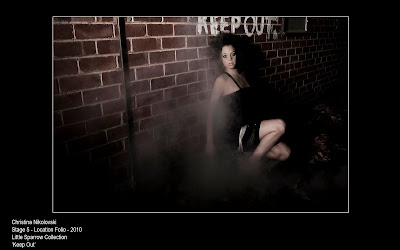
The following garments are designed by Little Sparrow, which is a local label recently launched by Dannielle Hewitt. The collection is Aphrodite. Each garment is photographed in a different location to emphasise the features and ideas behind each particular garment. It was extremely rewarding working with Danni and Georgia, I have a positive experience working with a fashion designer and I would definitely love to work with more designers in the future. In this series I challenged myself with finding interesting locations and movement, which was hard but definitely worth it.

Group (1)
This was my first group shoot ever. Complexity in terms of photography definitely increases in photographing groups. The lighting becomes more tricky if you are not employing 'safe' lighting, and the composition and posing becomes crucial. I feel like I got a lot out of this shoot, I quite enjoyed photographing a group and I will definitely do more group shoots to develop my skills and confidence. I am happy with my final result. Groups are certainly the hardest to organise in terms of a finding a time that suits 3 different models, a makeup artist, an assistant, 3 sets of clothes and styling in general, etc.

Couple (2)
Only two couple shots were required for this portfolio but I ended up photographing more, as last year I only photographed single subjects. I definitely gained a lot out of this and I like the different formations and compositions that can be achieved using couples. It definitely helps if the couple are actually together, but the more professional and confident the models are the easier they are to direct. Another element I incorporated in my work this semester is narrative in fashion photography, influenced by many of my favourite photographers. Newton said "I believe the perfect fashion photograph is one that doesn't look like a fashion photograph. A photograph that looks like it's something out of a movie.... a paparazzi shot, anything but a fashion photograph.” [1] This need not be true for every single fashion photograph taken, but I definitely think it brings fashion photography to a new level and creates a deeper interest for viewers. This quote has stuck in my head ever since I watched Helmut Newton's documentary, and I find that many fashion photographs that I am personally drawn to are narrative, whether deliberately fictitious or believable.

Studio Shots of my choice (7)

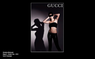
I have been extensively researching various campaigns and these have influenced my studio work this semester. I aimed to produce photographs that could be used in each different campaign for example Revlon, Calvin Klein, Gucci, Chanel, etc. Once again I did not plan on a series of work I treated each photograph or shoot as a completely different and individual concept. I challenged myself with lighting and interesting posing, as well as movement and graphical elements.

Overall

Overall I am proud of my work and I have gained a lot out of this portfolio. I will further develop my skills in directing groups by photographing more group shots in the future. Next semester I also want to challenge myself with even more specialised lighting and perhaps gels, and I think I am going to produce a series of work. I feel like I am more aware of what is out there and who is out there and all the research I have done really inspires me to keep pushing myself so that I don't ever become predictable. It also pushes me to keep improving my techniques and production and developing new concepts.


[1] Source: Newton, J Helmut by June, Canal Plus Byzance Productions, viewed 15 March 2010, < v="r9wkCLkVWcI">.


15/ Defining Style in Avedon's Work


Richard Avedon | Self-portrait, 1980

Richard Avedon is one of the most influential fashion photographers of all time. Born in 1923 in New York City, Avedon’s photographic career began in 1944 when he gained the role as a staff photographer for Harper’s Bazaar.[1] Much can be seen from Avedon’s body of work as it reflected almost every decade of fashion since the 1940s. The dramatic changes in fashion, culture, technology, style and gender coding can be seen in one man’s work alone.

I have been familiarising myself Avedon’s collection of work for a few weeks now in an effort to define his style. Avedon had a balanced collection of studio and location portraits. What is distinctive about Avedon’s collection of location work is it has a strong sense of narrative and emotion – fashion in Avedon’s photography is not just what I would call a ‘catalogue’ style – something was almost always happening – models are gambling, dancing, laughing, smoking, talking. Promoting fashion as a glamorous lifestyle was evident in Avedon’s work. Parallels can be drawn between Avedon’s work and the work of Helmut Newton in terms of narrative, although Avedon’s work contained much less nudity. Both photographers had a playful and cinematic approach to fashion photography.

Avedon’s style has developed since 1944. His collection of work in the 1940s was mainly location work, in which he photographed staged scenarios such as a female sitting at a restaurant table by herself ‘waiting’ for a call. Overall in this decade, the female figure was depicted as a happy strong woman. The cigarette is was a repeated symbol of strength and defiance and perhaps glamour. Men and women in photographs during this era were seemingly equal and content with their status in society.

Richard Avedon | Dorian Leigh with cyclist, 1949

As we move to the 1950s, studio photography became much more prevalent in Avedon’s work. There was still an element of playfulness, but a serious and superior element was now also apparent in Avedon’s work. Backlighting became more common in Avedon's work, featured mainly in his location photographs where the models are at an outing. Ambient light was now used in combination with artificial stage lights to achieve the effect of backlighting.

Richard Avedon |Suzy Parker, evening dress by Dior, Paris, 1956

Richard Avedon lights his subjects in a sunlit studio

Richard Avedon | Suzy Parker with Robin Tatersall 1956

Parker is backlit with what appears to be artificial light and front lit by ambient light or artificial light.

Richard Avedon | Suzy Parker with Robin Tatersall 1957

Whereas the 1940s predominantly featured a playful fun side of fashion photography, the work that Avedon produced in the 1960s was a balance of both playful and serious fashion photography. Nudity was introduced and studio fashion photography was further explored. Strong feminine lines were dominant in this body of work, emphasised by long tight dresses and a contrast of lighting and the background. Flash photography was now evident in Avedon’s work that can be seen in the catch lights of the model’s eyes in the studio, and the balance of dusk and the models in Avedon’s image of Jean Shimpton and Jeanlop Sieff.

Richard Avedon | Jean Shimpton and Jeanlop Sieff, 1966

In the 1970s a major development in technology became evident in Avedon’s work; colour. Avedon’s work was still predominantly shot in black and white, but colour transparencies were now also used. Avedon explored androgyny in his photography, which was particularly evident in his portraits of Veruschka in 1973, a female model who was photographed with a man’s shirt but with her breast’s showing and what arppeared to be a drawn on moustache and thickened eyebrows and short hair. Veruschka was also photographed in a man’s suit and tie with a top hat. With this new element evident in Avedon’s work he challenged the idea of ‘conventional’ fashion photography and the ‘typical’ female in society. Technically, Avedon’s photographs appeared sharper and less grainy, most probably due to an introduction of flash photography and perhaps digital photography.

Richard Avedon | Veruschka, New York 1973

Richard Avedon | Veruschka, New York 1973

Richard Avedon | Aurore Clement 1974

Richard Avedon | Janice Dickinson 1977

In the 1980s almost everything Avedon produced was in colour. Avedon began photographing groups of models and creating connections between them and interesting compositions. Avedon also made reference to religious paintings, this is evident in his Versace advertising campaign in the fall of winter of 1981-1982. Avedon also portrayed a suggested exploration of sexuality, which was also evident in the Winter Versace Campaign of 1981, where a heterosexual couple were photographed next to what appeared to be a lesbian couple.

Richard Avedon | Versace Advertising Campaign 1981

Richard Avedon | Versace Advertising Campaign 1981

In the 1990s Avedon produced photographs that were a balance of colour and black and white photography. It also appeared that some of his black and white work was shot on medium format film, showing that Avedon still had an appreciation or desire to use film when digital photography was now the norm. Multiple flash lights were used create more dramatic light in the studio, shown by the catch lights in the model’s eyes and the high ratio’s employed. Movement was again a dominant feature of Avedon’s style, now even sharper due to superior technology. Nudity and couple shots were common in this decade. Props were also more prevalent in Avedon’s studio shots, and these included sand, leaves, silk material, skeletons, toys, cigarettes and money. Flash was also used on location and backlighting was once again dominant in Avedon’s series titled ‘In Memory of the Late Mr. and Mrs. Comfort’. Composites were now a part of Avedon’s work, also evident in this series.

Richard Avedon, In Memory of the Late Mr. and Mrs. Comfort, 1995

Richard Avedon, In Memory of the Late Mr. and Mrs. Comfort, 1995

The more I look at Avedon’s work the more I realise how amazing he actually was. Since the 1940s when all that was available to a photographer was a basic film camera and no flash, Avedon created believable and interesting scenarios that employed an element of narrative to fashion photography. Every photograph featured in Avedon’s ‘Definitive Collection’ book has an element of interest; nothing is what I would term ‘stock’ photography.

In Avedon’s biography he mentioned that when he began studying photography at the Pennsylvania Museum of Industrial art he looked up to and was influenced by his teacher, Alexey Brodovich who was also the art director. He mentioned that he [Brodovich] ‘was very much like my [his] father’ (Avedon, 1933) [1] Brodovich’s theory was that ‘visual education was very dangerous and likely to develop certain clichés’[1], so he pushed his students to take a ‘unique’ stance with their photography. Students knew not to submit a photograph unless it had a new concept or unique or interesting suggestion.[2] Perhaps it was Brodovich who initially inspired Avedon to create these amazing masterpieces and strive to produce that ‘wow’ factor in his work since the 1940s. It appears that technology only helped Avedon capture what he visualised, he was a visual master all along.

Richard Avedon | Veruschka, New York 1967

Richard Avedon | Veruschka, New York 1972


[1] Squiers, C & Alletti, V 2009 Avedon fashion 1944-2000, Abrams, New York, p. 156.

[2] Squiers, C & Alletti, V 2009 Avedon fashion 1944-2000, Abrams, New York, p. 158.

Bibliography

Bellis, M 2010 Photography timeline, The New York Times company, viewed 10 June 2010, [http://inventors.about.com/od/pstartinventions/a/Photography.html].

Roth, P 2010 The Richard Avedon foundation, Avedon Foundation, viewed 10 June 2010 [http://www.richardavedon.com/#p=-1&a=-1&at=-1&mi=1&pt=0&pi=2].

Squiers, C & Alletti, V 2009 Avedon fashion 1944-2000, Abrams, New York.